Huckleberry Labs
Designing how parents log feeding (breast or bottle)
The short version
One feature, a couple of rounds, worked straight with the CEO. The logging pattern we landed on is still what Huckleberry ships today, eight years later.
Huckleberry is a parenting app most people know for sleep. In 2018 the CEO brought me in for something more scoped: how a parent logs a breastfeeding session. Not a redesign. One interaction, done right.
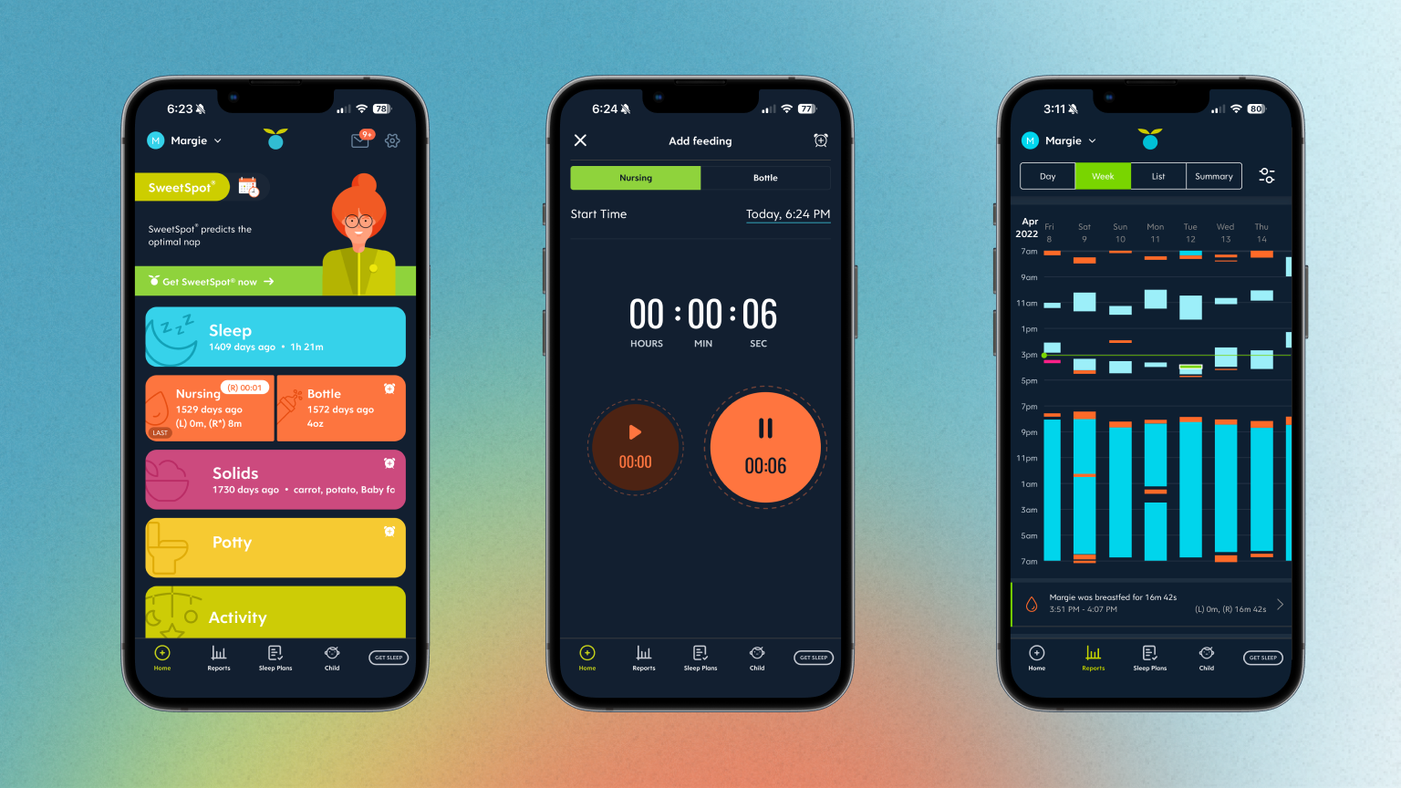
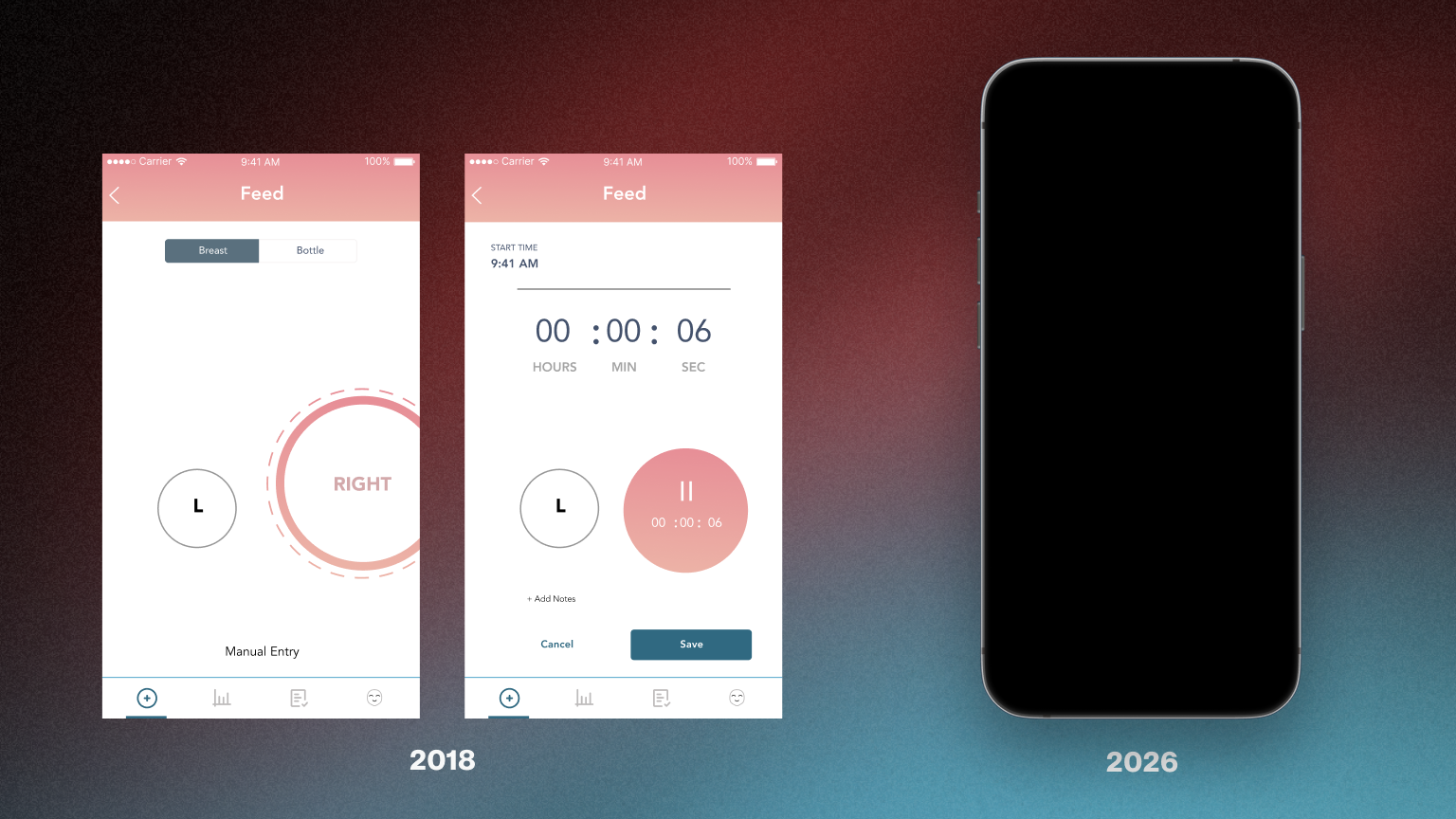
The team was small enough that I worked directly with the CEO across a few rounds instead of through product and engineering layers. We landed on a timer with a left/right side toggle and a manual-entry fallback. That is still the production pattern in 2026.
Why a whole engagement for one feature
Logging happens one-handed, in the dark, several times a night. Any friction and the data stops, and the app's sleep predictions are compromised.
Huckleberry's value is prediction: SweetSpot, the nap-timing it is known for. A prediction is only as good as the logging behind it. A parent tracking a feed is usually holding a baby, often exhausted, often not looking at the screen. The bar isn't "usable." It is usable with one thumb, without looking, at 3 a.m.
Feeds also carry more structure than they look: breast or bottle, which side, how long on each, or a pumped amount in ounces. Capture too little and the history is useless; ask for too much and nobody logs. That tension, fast enough to actually use but structured enough to be worth using, is exactly why it was worth the CEO's time to get right.
Working straight with the CEO
No PM in the middle, no eng translating. I annotated every screen with the reasoning and the open questions, and we resolved them round by round.
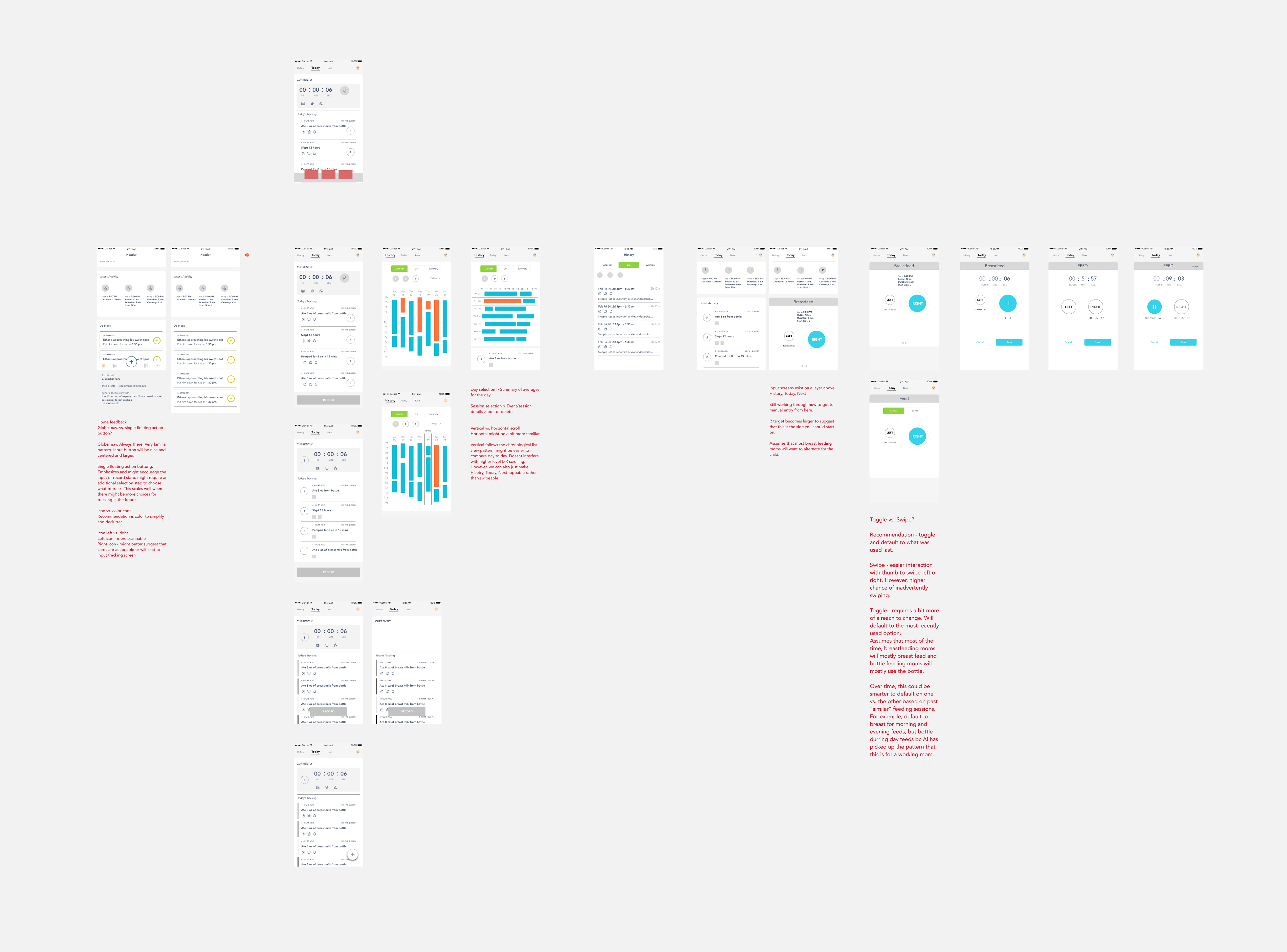
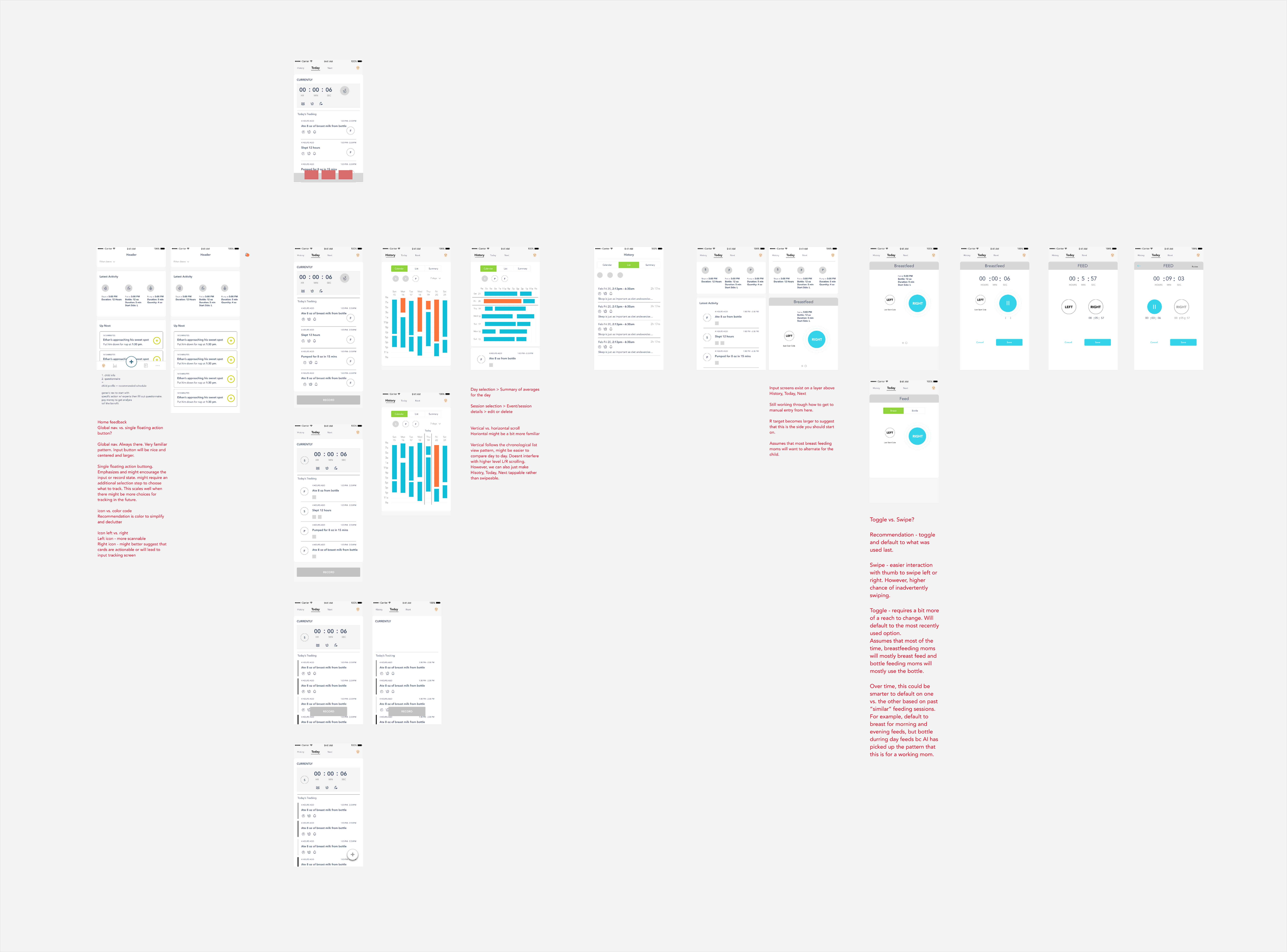
Because the team was small, the loop was just the two of us. I would send a round of mockups with my thinking in red directly on the screens: what I had decided, what I was unsure about, and the tradeoff I was weighing. The CEO responded to the reasoning, not just the pixels, and the next round moved.
You can watch the engagement compress across three rounds: Round 1 (concepts and open debates), Round 2 (mid-stream, cutting what was too heavy), and Round 3 (resolved). Some of the sharpest questions were engineering-adjacent: what a running timer does when you leave the screen. Getting those on the page early is what let us settle them in conversation instead of in a spec ping-pong later.

Two decisions, and the reasoning behind them
Every one of these started as a note-to-self in red text. Here is the why, not just the result.
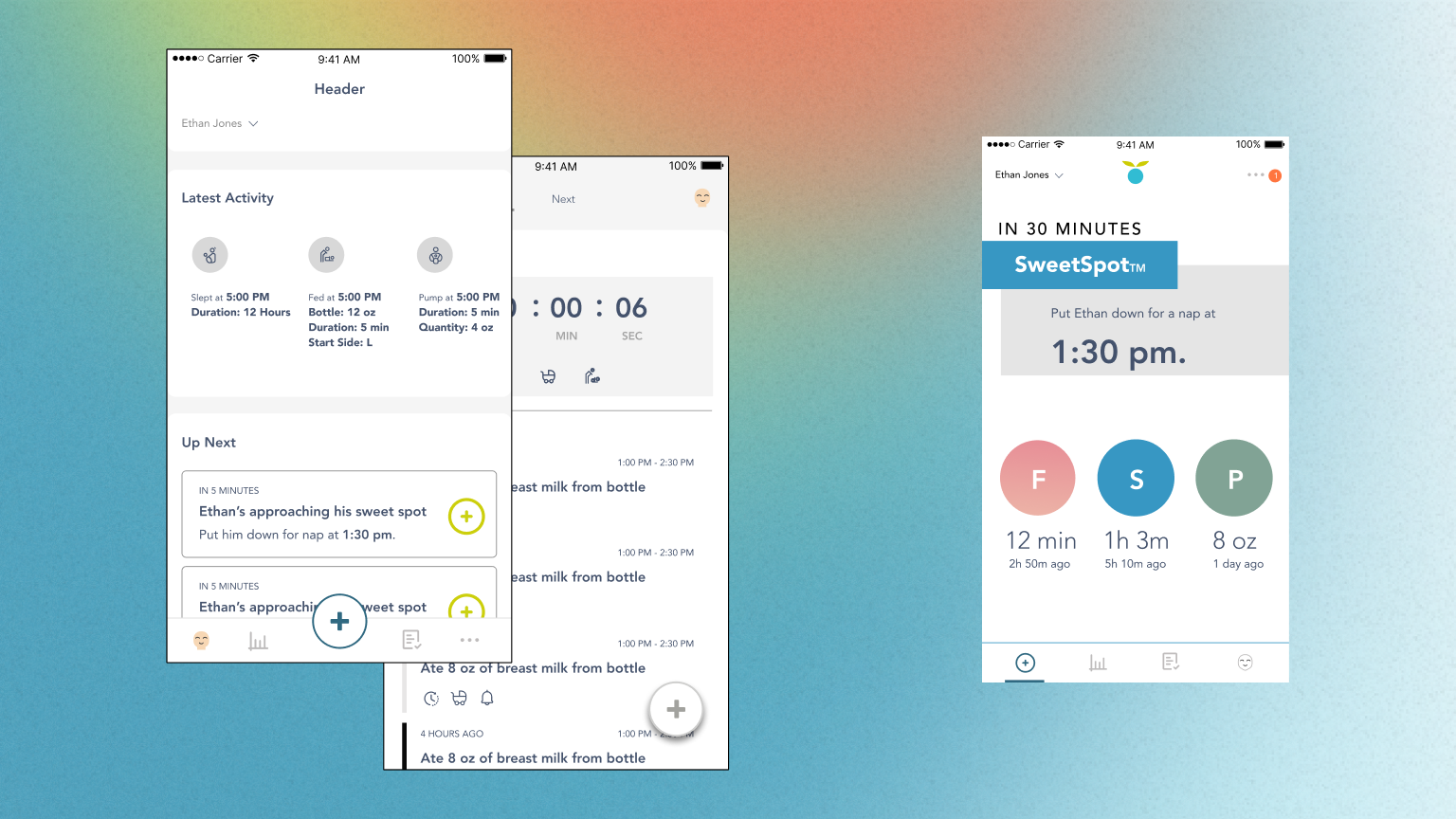
1. How you start a log. Round 1 debated a familiar global nav against a single floating "+" button. The button emphasized recording and would scale as tracking types grew, but it forced an extra "pick type" step every single time. By Round 3 the answer was neither, exactly: three large primary buttons, Feed, Sleep, and Pump, sitting on the home screen, each showing its last value and time since. One tap to the thing you do twenty times a day. I also pushed color over icons to declutter, and cut the prediction card down: the earlier SweetSpot card was too text-heavy, so I gave the time and the action the hierarchy and dropped the rest. Additional features have been added since I was asked to design the feeding interaction (e.g. solids, potty, activity).
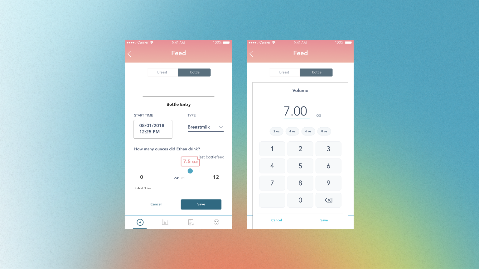
2. Ounces: speed vs. precision, without choosing. Bottle and pump entries need an amount. A slider is fast and thumb-friendly; a number field is precise. Rather than pick, I did both: a 0 to 16 oz slider that defaults to your last amount for the common case, with a tappable value box to type an exact number when it matters. A one-time coach mark ("use the slider, or tap the box to input manually") teaches it once. Fast by default, precise on demand.
What shipped, and what held up
The pattern survived every round, shipped, and is still what Huckleberry uses in 2026.
The timer-plus-side-toggle, with a manual-entry fallback, is still the production pattern Huckleberry uses for breastfeeding today. Eight years later, it hasn't needed replacing. It's a useful reminder that good interaction design doesn't have to be complicated to hold up.
The engagement extended beyond the feeding interaction itself. I also worked through the home prediction card, pump and sleep logging, calendar and summary history, and subscription placement. The resulting model kept a useful recommended schedule free to start, while putting personalized schedules and deeper analysis behind the subscription.
What I'd revisit
Small engagements teach sharp lessons.
-
Let the toggle get smart
We designed the hook, default to the last side used, but I always wanted it to actually learn: breast in the morning, bottle midday for a working parent. The data was right there; it just needed the model behind it. Shipping the affordance without the intelligence was the right call for the timeline, but it is the first thing I'd go back for.
-
Fewer taps isn't always the win
The instinct on a logging tool is speed. But the optional-tags pattern taught me the opposite is sometimes right: keep the required path tiny, and let the parent opt into more when they have a hand free. What's interesting is how early this landed in my career, and how much it shaped me later as a payments designer. We always chase the most frictionless experience, but in the right places a deliberate bit of friction is what builds trust: it signals that Huckleberry takes a parent's inputs seriously, or that Amazon isn't being sloppy about how a payment method gets registered and selected. Knowing when to add friction, not just remove it, is a lesson I've carried across every product since.