Amazon Payments
Bringing Over-the-Counter (OTC) Benefits shopping to Amazon
The trailer
$9 billion in health benefits goes unspent every year. Most of it because people like Millie don't know what they have, or how to use it.
Millie Walker is 66, lives in Westchester, and carries a Medicare Advantage card worth $400 a year in over-the-counter and grocery benefits. She forfeits some of it every month. She doesn't know her balance, she's unsure what's covered, and her only options are a brick-and-mortar aisle, a clunky microsite, or a paper catalog.
This project brought OTC benefits shopping to Amazon for the first time. I owned the experience across three touchpoints: registering a benefits card, discovering eligible products, and paying with live benefit math at checkout, all without breaking Amazon's checkout speed or cluttering it for the 99% of shoppers who'd never use it.
It launched January 1, 2026. Millie now shops her benefit the way she shops everything else: half a million eligible products instead of a picked-over aisle, Amazon delivery instead of a trip across town, and a coverage check before she pays instead of a guess at the register. The benefit she used to forfeit at the end of the month now has somewhere to go.
The win runs both ways. Millie gets selection, speed, and the flexibility to split an order across her benefit and her own card without learning a new site to do it. Amazon gets a customer segment and a payment method it previously couldn't serve, arriving with benefit dollars already funded and waiting to be spent.
Medicare Advantage's $9B problem
Around 70% of OTC benefits go unredeemed.
35 million seniors are enrolled in Medicare Advantage plans. 87% of them receive over-the-counter benefits, roughly $400 a year to spend on medicine, wellness products, and food. That is about $13.5 billion in annual spending power.
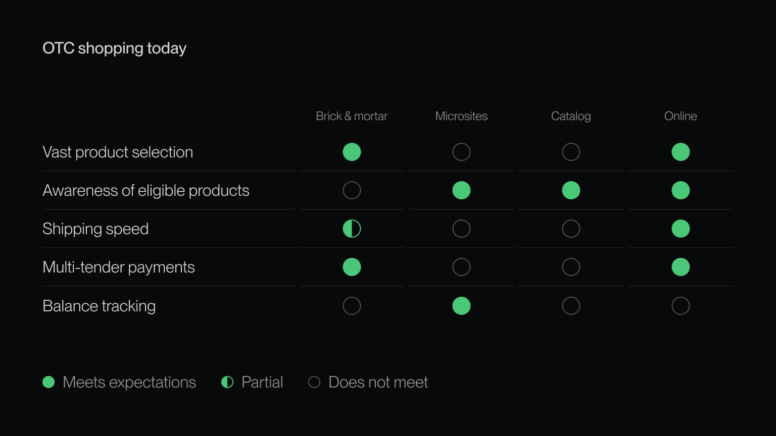
The reason isn't apathy. It's friction. Before this project, a cardholder's options were a physical store, a benefit microsite, or a printed catalog. Each one broke down on at least one of: product selection, knowing what's eligible, shipping speed, paying with multiple tenders, or seeing a live balance. Amazon, the default shopping surface for tens of millions of these same seniors, couldn't take the card at all. It was a competitive gap with a nine-figure customer-benefit number attached.

My role
Primary UX designer across three key touchpoints.
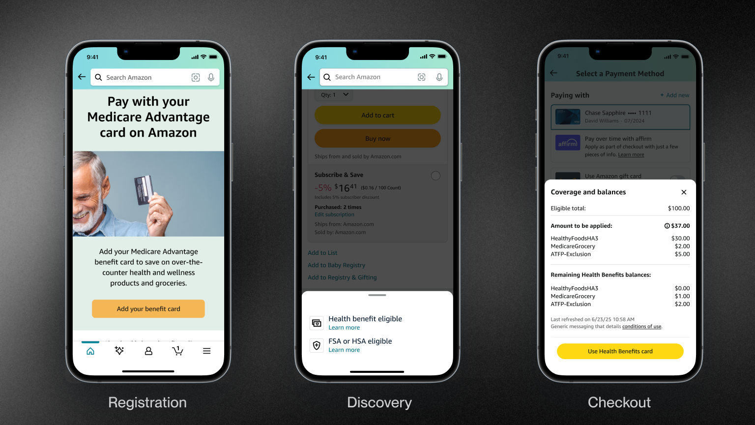
Registration. Adding an OTC Network Benefits card to the Amazon wallet.
Discovery. The OTC storefront, eligibility badging, and a search filter for covered products.
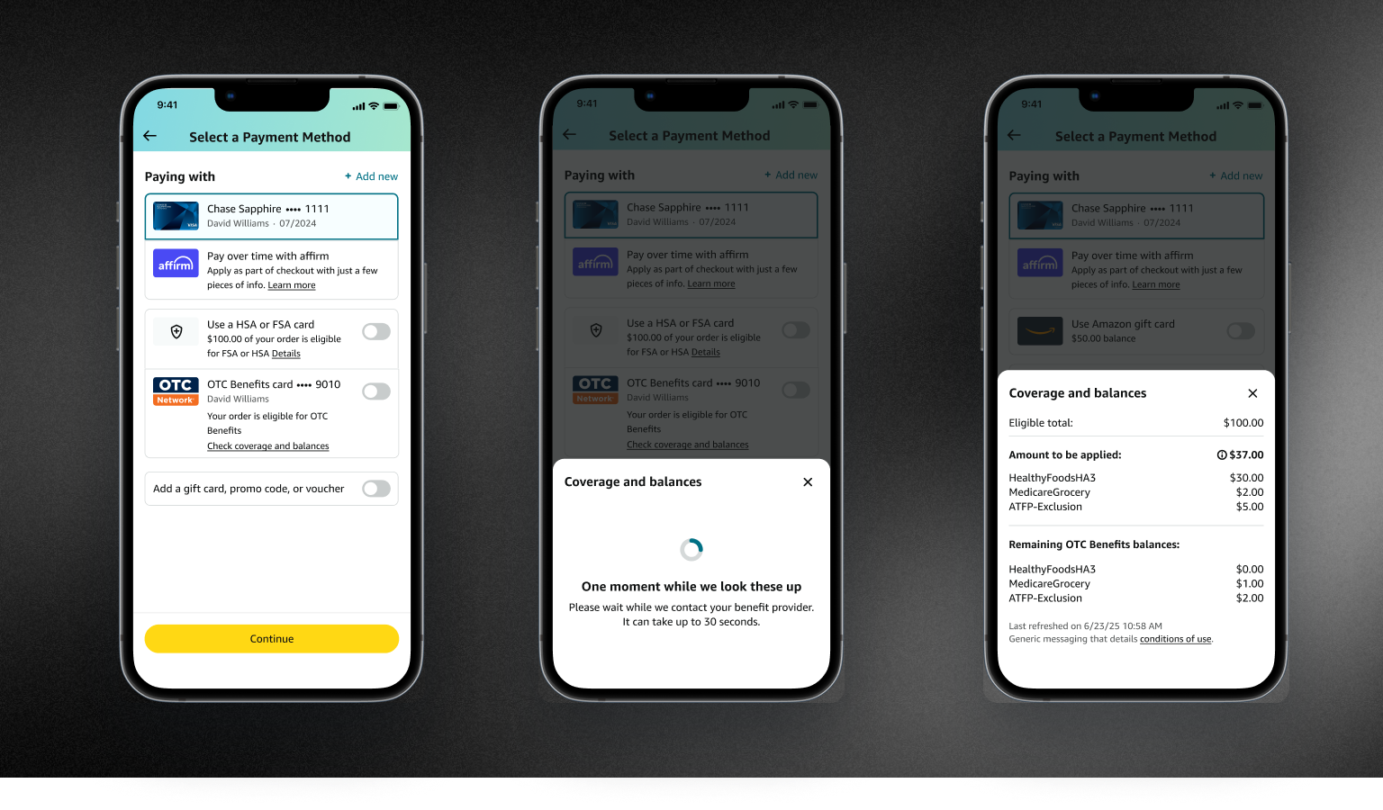
Checkout. The payment selection page, the adjudication interstitial, and the coverage-and-balances bottom sheet.
I also authored the Walk the Store deck, the end-to-end narrative used to bring a VP audience through the launch, in three weeks. It became the team's reference example for what a VP-level Walk the Store should look like.
I value research deeply, but given budget constraints and how quickly we needed to move, we didn't do the qualitative research I'd have liked. The customer model came from secondary Medicare Advantage data, what our partner InComm knew about cardholders, inputs from Product, Program, and Engineering, and reuse of Amazon's existing payments research.
Core journey

Registration via Amazon Health

Registration during checkout

Discovery during search

Checkout with coverage estimator

Checkout sans coverage estimator
Key insight
A single cardholder can have their balance split across as many as 92 distinct "purses."
Benefit cards are not like credit cards. OTC, healthy food, rewards, plan-specific allotments, each with its own eligibility rules and its own remaining amount. The first concept put all of it inline on the payment selection page, right where you pick a card. The reasoning was sound: maximum transparency, no extra taps.
Working through the layout is what surfaced the problem: transparency and clarity are not the same thing. The payment page already stacks credit and debit cards, HSA/FSA, gift card balance, promotional balance, Affirm, and rewards points. Adding multi-purse benefit math on top turns a payment picker into a balance sheet at the one moment a customer is trying to do a single thing, which is pay. For Millie, spending a benefit for the first time on a new platform, more numbers on screen do not read as more control. They read as more to work out before it is safe to tap the button.
So coverage and balances moved into an opt-in bottom sheet, one tap behind a "Check coverage and balances" link. Customers who want the detail get a full-width canvas built to hold it: eligible total, exactly how much each purse applies to this order, and what is left after. Customers who don't get a checkout that looks like the one they already know. The tradeoff was deliberate, one-glance visibility traded for hierarchy, and it shipped as the pattern for benefit transparency at checkout.
What I'd change
Access was the revolution. Confidence is the next bar.
-
Discoverability shouldn't live in a search filter
Today, eligibility surfaces through email marketing and a filter most people won't find unless they already know to look. The detail page is where high-intent customers actually are. I'd fight for a contextual nudge there: this is OTC-eligible, here's your card, tap to see what it'd cover. Meet Millie where she's already shopping instead of asking her to learn a new filter.
-
Design in good friction for this customer
The default Amazon impulse is speed: in and out, fewest taps. For a 66-year-old spending a $400 benefit for the first time on a new platform, I'd argue the opposite, that a small amount of intentional friction (confirmation moments, balance visibility, eligibility nudges) is the right call, even though it cuts against the institutional grain. Letting these customers shop on Amazon at all is already a leap forward. The next bar isn't faster. It's more confident.
-
Visualize the balance, don't tabulate it
The bottom sheet is text-dense because its content model was inherited from what was originally destined for the payment page. With more time, I'd explore a glanceable visual, purse breakdowns as a snapshot, not a table to parse, which serves an older user far better than a column of numbers.